A 2021 guide for mobile app designers on how to design dark mode
By
Last Updated May 06, 2023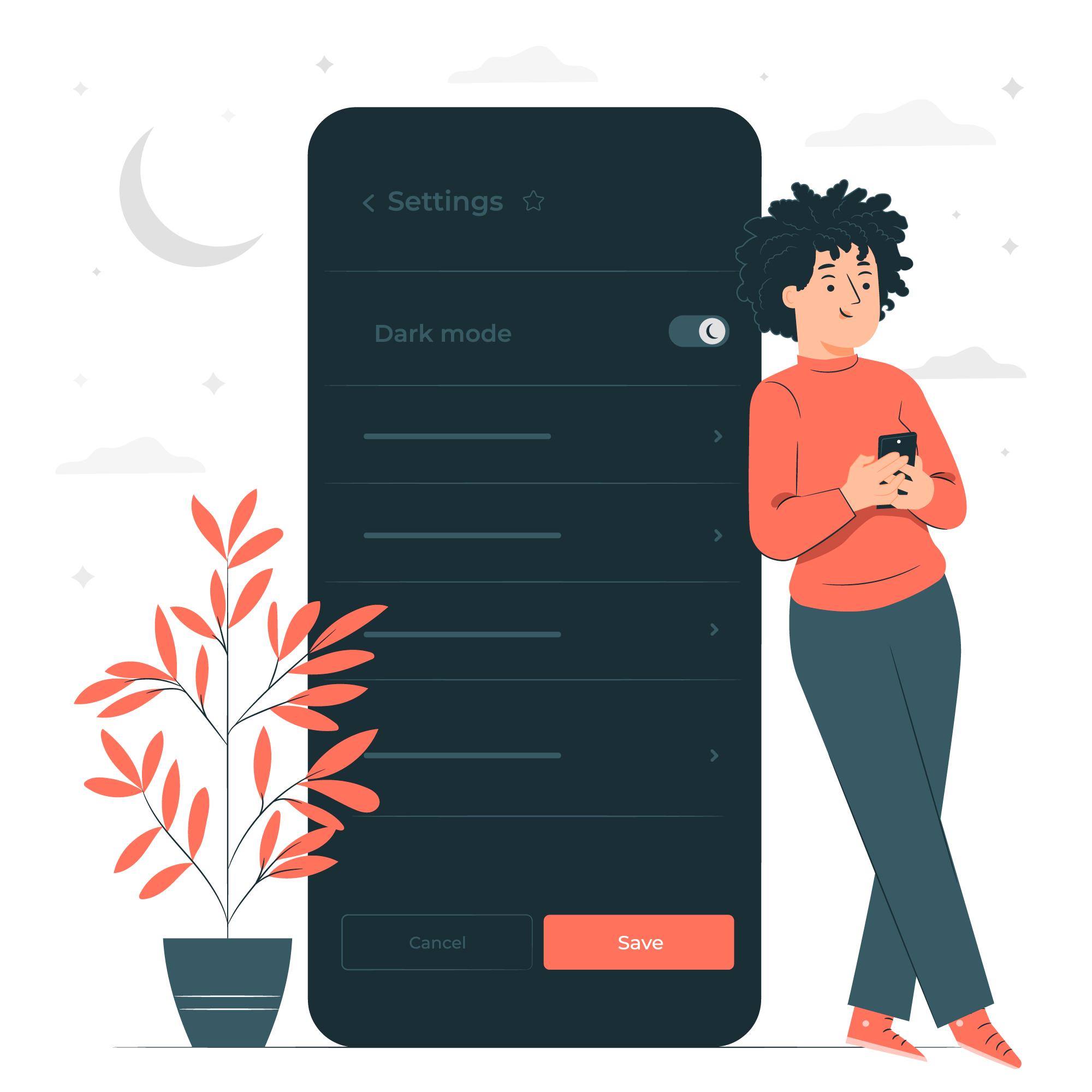
Table of Content
-Introduction
-How to Create a Dark Theme for an Andriod App
1. Gray versus black
2. Color attention to detail with accents
3. Preserve Battery Life
4. Choosing colour combinations that are accessible
-Elevation:
-How to Create an iOS App in Dark Mode
-Tips for Creating an Effective Mobile App Design of a Dark Theme
-Finishing
Introduction
Dim the lights, close your eyes, and conserve energy. Dark mode is one of the most popular design trends, and world-class brands such as WhatsApp, Instagram, Google, Facebook, and Apple have already jumped on board.
The official release of Android 10 and iOS 13 highlighted the Dark theme User Interface. Apple and Google have been devoting resources and attention to the dark mode for the past year.
The benefits of using the dark mode are unprecedented if done correctly. They are easier to read in low light. They alleviate eye strain. Based on the screen, they can significantly reduce battery consumption.
Having a Dark Theme ready for an app is becoming a requirement for any mobile app design company. Nonetheless, the challenges of designing a dark-mode app cannot be overlooked. It is not possible to simply reuse or invert colours. If you do this, you will get the polar opposite of what you want.
When the dark mode is poorly designed, it causes eye strain and makes reading in low light more difficult. This theme's low brightness creates a sense of security in a dark environment. As a result, when developing gloomy themes, ensure that they are enjoyable, balanced, and readable.
In this article, we will look at how mobile app designers can begin to deliver a dark-mode UI design experience.
How to Create a Dark Theme for an Android App
Google provides extensive documentation to assist designers in understanding how to design dark themes for Android apps.
The tech behemoth has established four principles that define the dark theme User Interface and provide a starting point for developing dark mode app design –
1. Gray versus black
The first thing you'll notice is that the default background for apps in the dark theme is dark grey, not black: #121212.
There has been a lot of debate about why we chose grey over black, especially since the platform in Android 10 has a black background. This is primarily a trade-off between usability and energy savings.
The colour #000000 is pure black. Using a pure black #000000 colour as the platform's background allows system apps and surfaces to use as little power as possible when open on OLED displays. Because these system surfaces are typically just text and simple icons, we can adjust the text and icon colors to combat contrast issues.
Surfaces in apps, on the other hand, can contain anything: complex colourful vector animations, vibrant imagery, contrasting branded surfaces, and much more. When these are placed against a pure black background, the resulting contrast is much higher, which can cause eye strain. As a result, using a light or grey background is the solution.
2. Color attention to detail with accents
When creating colour scheme for a Google recommends using limited colour accents in dark theme UIs when defining a colour scheme for a dark UI, so the majority of space is dedicated to dark surfaces. Keeping the background dark also makes the photo visuals deeper and creates a pleasing contrast with the accent colour. Using split complementary colours can be beneficial. The scheme consists of one
dominant colour and two colours adjacent to the complement of the dominant colour. This provides the necessary contrast while avoiding the tension of the complementary colour scheme.
3. Preserve Battery Life
Dark themes reduce the luminance emitted by device screens while maintaining colour contrast ratios that are minimum. They contribute to better visual ergonomics by reducing eye strain, adjusting brightness to current lighting conditions, and facilitating screen use in low-light conditions.
and allowing screen use in low-light conditions – all while conserving battery power The ability to turn off black pixels at any time of day or reduce the use of light pixels benefits devices with OLED screens.
4. Choosing colour combinations that are accessible
Meet accessibility colour contrast standards to accommodate regular dark theme users (such as those with low vision).
In the Google Material Design Guidelines, they have specified various properties for the Dark colour scheme and overall mode –
Elevation:
When designing a dark theme, the components use the same default shadow components and elevation levels as in a light theme. What differs is the illumination of the elevation levels' surfaces.
The lighter a surface elevation is, the higher it is. The lighter the surface, the higher the elevation of the surface. The lightness is demonstrated by the use of semi-transparent overlays. Overlays also allow you to distinguish between the components and see the shadows.
Accessibility and contrast:
In a dark theme UI design, the background should be dark enough to show white text. They must use a minimum contrast of 15.8:1 between the background and the text. When added to surfaces at the highest elevation, this ensures that the body text meets the WCAG's AA
standard of 4.5:5:1.
Colours:
Designers should use desaturated colours to increase legibility. The selection of primary and secondary colours must also take into account both light and dark UI themes.
Light text on dark backgrounds:
When light text appears on a dark background, the following opacity levels must be used:
-
The opacity of high-emphasis text is 87%.
-
The opacity of medium-emphasis text and hint text is 60%.
-
The opacity of disabled text is 38%.
Overlays are used to communicate the status of interactive elements for dark theme layouts or components. States in the dark theme must use the same overlay values as the default light theme. Surface and Primary are the two containers that inherit the state overlays.
Surface containers that use the Surface colour must use an overlay that matches the text or icon colour. The state overlay for surface containers that use the Primary colour must be white.
How to Create an iOS App in Dark Mode
Apple has redefined the meaning of UI styling and colours in iOS with dark mode. Let's take a look at the changes that Apple has made to assist you in designing for dark mode on iOS 13.
Colours with meaning
To balance the feel and appearance of iOS apps in both light and dark modes, Apple has introduced semantic colours for commonly used UI components. These colours do not have the best RGB value; instead, they directly alter the iOS interface style. Furthermore, in dark mode, these semantic hues help with overlay colour and text.
Colors of the system
Apple has introduced nine predefined system colours that support the dark overall appearance and dynamic of the system. As a result, As a result, these colours change depending on the interface style.
Effects of Vibrancy and Blur
Apple introduced four blur effects and eight vibrancy effects with iOS 13, which automatically adapts to the iOS interface style.
The blur effects in dark and light modes are as follows:
Apple has also added four vibrancy effects to the iOS dark mode typography
SF Symbols
Apple provides a collection of over 1500 symbols in their Human Interface Guidelines for Product Developers and Designers to use in their applications. They look fantastic in Dark Mode because they have been optimized for both light and dark UI.
Tips for Creating an Effective Mobile App Design of a Dark Theme
Dark mode has been one of the most requested features in recent years. Apple and Google both made the dark theme an integral part of their user interfaces. The reduced luminance of Dark Mode provides safety in low-light environments and can reduce eye strain.
Certain processes must be followed when developing a dark-mode UI. After all, you desire your Certain processes must be followed when developing a dark-mode UI. After all, you want your product to be fantastic, don't you? Let's check off all the boxes to create a best practices checklist for designing a dark mode for your app.
1. Avoid using pure black.
A dark theme cannot have white text on a black background. In fact, looking at a high-contrast screen can be difficult.
When adding a dark mode to your app, it is best to use dark grey as the primary colour for the dark mode components, as it reduces eye strain and makes it much easier to see shadows on a grey surface than on a black one.
2. Avoid using saturated colours on dark themes.
The saturated colours that look great on light surfaces can vibrate against the dark background, making it difficult to read the text.
You should use light tones because they are easier to read and don't make the UI overly expressive, which saves unnecessary eye strain.
3. Think about the emotional aspects of your app design.
When you design a dark theme for your app, you should aim to replicate the emotional feel of your light theme design in the dark theme as well.
However, this is a bad idea. Because, in the end, different colours elicit different emotions. As a result, the colours in your dark mode will have a different effect.
4. Put the design through its paces in both appearances.
It is necessary to test the app twice a day to see how it performs in different light conditions, just as your users would toggle between both theme UIs at different times of the day. And to ensure that it meets your requirements.
5. Use dark mode in animations and illustrations.
If your app contains animations or other graphic elements, you must plan for their use in the dark theme as well. If the illustration includes a subject and a background, fully desaturate the background colours to help keep the focus on the subject.
6. Meet colour contrast accessibility standards
Ensure that your content is easily accessible. 6. Meet colour contrast accessibility standards
Make sure your content is still legible in Dark Mode. Surfaces with dark themes must be dark enough to display white text. Google Material Design suggests a contrast ratio of at least 15.8:1 between text and background. To test the contrast ratio, use colour contrast tools.
7. Do not simply reverse
When switching from standard to dark mode, the original theme may provide useful visual cues. Don't just flip the colours to make a dark theme. You could be converting psychologically significant colours into meaningless bland tones. Make a conscious choice about the colours you use.
8. Use the appropriate "on" colours
'On' colours appear on key surfaces and elements. They are typically used for 'On' colours that appear on key surfaces and elements. They are typically used for text. The default 'on' colour for a dark theme is pure white. However, it is a vibrant colour that would stand out against dark backgrounds. As a result, Google Material Design recommends a slightly darker white.
-
The disabled text has a darkness of 38%.
-
Text with a medium emphasis is executed at 60%.
-
The darkness of high-emphasis text must be 87 percent.
9. Dig deep
The lighter a layer should be, the higher it is. In dark mode, this will create a visual hierarchy that goes from the most used elements in your display to the least used.
You now understand everything there is to know about designing the dark mode version of your app.
You now understand everything there is to know about designing the dark mode version of your app. The next actionable step is to contact a team of experts who have used the UI in applications. This should be viewed as a step closer to achieving your goal of providing a healthy experience to your end users. hy suite, three in overlay, and one in separator They are as follows:
Finishing
You now understand everything there is to know about designing the dark mode version of your app. The dark mode app design revolution is just getting started. That means now is the time to go dark and get creative. The next actionable step is to speak with a team of UI experts who have implemented the UI in applications to gain a realistic understanding of the value of UI design in app development. This should be viewed as a step closer to achieving your goal of providing a healthy experience to your end users.
Recent Posts
Get a Free Quote.
Lets Build Your App!
Connect
Related Jobs 
More Latest News and Blog at Syoft


Let's Try! Get Free Support